 Illuminating Color Illuminating Color
by Elizabeth O. Dulemba
as seen in a condensed form in
the Mar/April 2009 SCBWI Bulletin
Have you ever seen artists who could draw well, but when they applied color, their work went south like a duck in winter?
I was a corporate in-house illustrator for twelve years before illustrating children's books. Back then, I often created drawings which were sent out for freelancers to render. I didnt paint my own art — shocking.
But at the time, while I could draw like crazy and apply simple, cartoon-like color easily, I couldnt pull off the painterly, fine-art looks that I admired. Working with line, light and shadow is the basis of all art; but despite playing with crayons since the age of one, I hadnt learned how to color yet. Like Dorothy entering Oz, I learned that black and white is only the beginning of the story.
How did I learn to properly use color? I became more observant. I trained my eyes to see what was really there rather than what my brain expected to see. I chose a medium, no small task, and started experimenting. I studied how the masters manipulated reality and practiced their methods. Its taken me years to understand color, and the more I learn, the more Im fascinated by it.
  Just as there are values in black and white (from the lightest light to the darkest dark), there are values in color. Maintaining a colors hue (red, green, yellow) as it moves from light to dark is not achieved by simply adding white or black. Adding white creates a tint. Adding black creates a shade. Both methods alter a colors saturation (or intensity), dulling it or even turning it muddy. Sometimes its the right thing to do, but oftentimes not. Just as there are values in black and white (from the lightest light to the darkest dark), there are values in color. Maintaining a colors hue (red, green, yellow) as it moves from light to dark is not achieved by simply adding white or black. Adding white creates a tint. Adding black creates a shade. Both methods alter a colors saturation (or intensity), dulling it or even turning it muddy. Sometimes its the right thing to do, but oftentimes not.
Colors change and affect each other, their values can play tricks on your eyes. Putting a red and green of equal value next to each other will make them vibrate as they fight for position on the visual plane. If all the objects in a composition share the same value, nothing moves forward or backward, making the art feel flat. Using values improperly can push images forward and backward that perhaps shouldnt be, throwing off a compositions perspective. as they fight for position on the visual plane. If all the objects in a composition share the same value, nothing moves forward or backward, making the art feel flat. Using values improperly can push images forward and backward that perhaps shouldnt be, throwing off a compositions perspective.
Its important to consider the ultimate background. White paper or canvas adds a value which must be consciously dealt with. A white surface affects your ability to move objects through the visual plane. Watercolorists use it to their advantage, working from light to dark, the paper being their lightest value. Colored pencil artists often lay down a color wash to hide the white tooth of the paper that would otherwise show through. Painters obscure a canvas completely when laying in their under painting or value study.
Controlling your surface also allows you to decide where to use white. After all, there is little in our world that is truly white. What we call white is actually the reflection of the entire color spectrum. Next time youre in a hardware store, look at the white paint chips. I bet you cant find one without a hint of color.
In contrast, black is the absorption of all colors and is also hard to find. I love to ask kids during school visits, What color is a shadow? Inevitably they say, Black! or Grey! But this is rarely true. In low light, the first color to drop out of the spectrum is red, which means most shadows fall into various shades of blue.
Next time you see a shadow, study its complexity. Youll find blues, greens, yellows, and yes, even reds. The reason is light color and light are inseparable.
A light source in your illustration doesnt have to be as obvious as the sun or a lamp. It can reflect off of and shine through other objects. This means there is rarely one light source in any setting, but rather a key (or main) light source and fill (or opposing/contrasting) light sources.
I tell my Beginning Drawing students at the John C. Campbell Folk School to think of light as water, splashing or wrapping around objects and bouncing off surfaces. Imagine a warm, yellow sunbeam streaming through a window. What happens when that light hits a blue wall then bounces off to reflect on a brown toy chest? Light sources are rarely without color and they affect and are affected by the colors of the objects they touch.
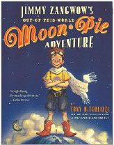
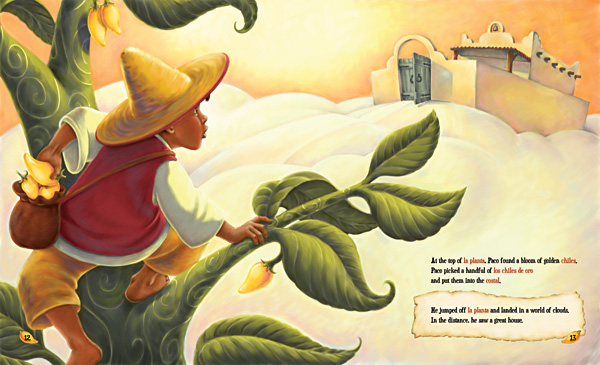
A warm key light may throw shadows into cool hues (like blues), but the opposite can also be true. In Jimmy Zangwows Out-of-This-World Moon-Pie Adventure, Tony DiTerlizzi added a nostalgic feel to his art by creating shadows in blues and turquoise and then applying a golden yellow glaze. It's one of Tony's earliest books, but I loved studying it when I was working on my own technique.
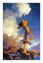
I also studied Maxfield Parrish. He was famous for exaggerating this contrast of warm versus cool light and the moods it created. He was a master at pushing objects forward and backward in a visual plane by setting them against their contrasting values light on dark, or dark on light. High contrast attracts attention like a spotlight. In fact, when planning your composition its a good idea to think of yourself as a stage designer.
Tony says he always thinks of his books as stages, either zooming in or showing the stage in entirety. To draw the viewers eye, his main characters often wear primary colors in contrast to their more neutral surroundings. He says, The child always knows where to find the hero in the story.

As James Gurney, creator of Dinotopia and his latest, Journey to Chandara, says, Next time youre sitting absent-mindedly in a dark room, take note of the fact that you instinctively rest your gaze on the lightest area of the scene . . . White shapes in the center of a composition are a sure-fire eyeball magnet.
Shine the key light on the star, the spot where you want the viewers gaze to go first. There, the contrast will be strongest, colors most saturated, and details most pronounced. Less important characters or parts of the scene may be illuminated by a secondary, weaker light source which relays less information.
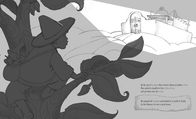
Ironically, most artists have a default light source, a way they typically illuminate their work when theyre not thinking about it. Its part of what contributes to their overall look or style. My default light source is usually from above left. Tonys default light source is from above right. He says he sometimes places an X on the edge of his drawings to indicate a light source that he wouldnt typically use to consciously direct his spotlight.
James sometimes uses contre-jour, a type of backlighting where you place the subject right in front of a bright, sunny sky. He says, When a form is placed contre-jour, it goes into silhouette. The colors weaken. Shadows stretch forward. Details disappear as the glare of the light spills over the edges of the form.
Like a director, think about your setting. Is light high in the sky or near the horizon? Is it making shadows short or long? Is the light warm or cool? Color and light will be different on a sunny day in Arizona versus a rainy day in London. Make sure your light and color choices reflect the feel of a place.
Tony says, If your story is about kids going through a divorce, a harsh time, use a palette drained of color; but for the happy ending bring in warmer, happier colors. Set the stage for an emotional response to the story.
James says, For me, creating depth and illusion is one of the most exciting goals of painting, but it's just a first step, because the higher goal is to select, accentuate, and subordinate all the elements of the picture to communicate a particular mood or feeling, and that goes beyond mere illusionism.
The proper and creative use of color and light is often the elusive difference between amateur and professional looking art. While learning to apply color well can be challenging, its fascinating when you begin to understand the effect light and color have on us, our moods and the world around us. Its even more exciting when you apply this understanding to change and strengthen your own artwork.
Although Ive only just begun to understand colors complexities, Im starting to make color and light really work for me. Im finally pulling off that painterly, fine-art look I always admired because Ive finally learned how to color.
# # #
Visit Tony DiTerlizzis website (and The Spiderwick Chronicles) at diterlizzi.com. Work on his forthcoming project can be seen at his blog, diterlizzi.com/blog. For further study, Tony recommends THE FANTASY ART TECHNIQUES OF TIM HILDEBRANDT.
Find more book recommendations, light and color techniques at James Gurneys blog, gurneyjourney.blogspot.com, and more of his work at jamesgurney.com.
Elizabeth O. Dulemba is an award-winning illustrator of several books for children. Learn more about her and her artwork at dulemba.com.
Training images are from Color Worqx - visit to learn more.
More good color reference sites:
COLOURlovers.com
Color Palette Generator from jrm.cc
Color Combos
Color Wheel from Colors on the Web
ColorToy 2.0
Learn About Light (links to teacher projects and scientific articles about light)
More color resources at Web Design Booth
|
|