illustration Friday: Discovery & Postcard Demo
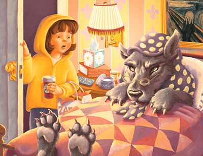
Little Yella riding hood went to visit her Grandma (with a bag full of bagels from Zabar's and a Starbucks Chai Latte) only to discover . . .
A while back, somebody asked if I would talk about my process with promotional postcard mailings. Since I'm using my latest postcard art for IF this week, I thought it would be a perfect time.
I like to use Premium Postcard for my printing. They have no minimum print requirements which means I can send out a very targeted mailing list for less money. They are also run through the US Postal Service, so postage is included in their prices, and I can do everything online, including build my mailing list.
When I'm ready to send my postcards, I just upload my art, click the names I want to mail to, and voila! I do, however, mail myself a proof postcard first. PP uses a coated glossy stock which holds up great in the mail and looks very professional, however, it tends to blow out the saturation of my art. So I usually send a very dummed down version of my art colorwise to get a good result.
I build my postcards in Photoshop and save them as .jpgs to upload.
Here's the front of my latest:

Notice I have my name and contact information on the front. Art Directors will often pin postcards they like to a bulletin board. You never know what could sway an Art Director to hire you over somebody else, so make things easy for them. Include your contact information on the front so they don't have to fumble with your postcard to get in touch with you.
Here's the back of my postcard:
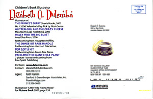
On the back I include my name, relevant title (children's book illustrator), a list of books I've illustrated with the publisher's name and any accolades they've received. I have my website address so they can see more of my art at my online portfolio (this is important and what makes the postcard/website advertsing technique so effective.) I include contact information for me and my agent. The art for this particular postcard is also published in this year's Picture-Book annual, so I included the page number. PP also has room for a small vignette of art - I included the "snout cream" from the bedside table. (This is an actual mailed postcard, so you can see the USPS logo and mailing strip.)
I mail different art out three to four times a year to a mailing list I've pulled together by studying trade magazines and researching online. It's down to a select group of Art Directors and Editors with whom I'd especially like to work.
And that's it! Hope you find this helpful.











21 Comments:
Beautiful painting, love the lighting effects.
Gorgeous piece! Love all the detail!
Love the look of discovery on her face!
great mailer sending tips!!
Love your illo! Esp love the Munch piece behind the wolf!
a GREAT artwork!
I love her face!
Bellissimo!
Cata
Your illustration is exceptional. I can see every detail was considered. And I truly appreciate you sharing this with all of us. I just started a course for writing/illustrating children's picture books, so this is nice to learn. I wish you the best!
Great piece!!! I love it!!
I like this piece a lot! It makes a great promo piece. I appreciate your sharing this useful information with us all.
Great post! You must get some good contacts with these postcards. I wish illustrators would send cards to me. They've stopped sending them to me now that I am an interactive art director. However, my need for varied illustrators is even more now than it was for print. I would suggest that you include interactive art directors and web designers on you list if you'd be interested in illustrating for websites, flash presentations and storyboards.
Hi Elizabeth,
I love the details like the decorative box of kleenex and the "Scream" painting.
I loved this so so much, that I had to go out and buy a bakers dozen of BAGELS. This illustration has so much detail, yet it isnt busy or overdone. I love the addition of the snout cream on the back of the postcard. Thanks for the advice about your postcard choice and setup.
Once again THREE CHEERS for "e"!
The expressions on both faces are perfect! i just love the detail and emotion in your work. And thanks for the information about the postcards. I have had to order so many more postcards than I need beacuse of the way the company I use breaks down their orders. It's such a waste!
Awesome work. Perfect for the theme! Nice tips on postcard mailings, too. Thanks!
the wolf looks like he cant wait to sink his teeth into some fresh hot bagels and wash it all down with some coffe. he has good taste. i bet he wasn't expecting delivery. another nice one
Great postcard tips, and a superb illustration.
Your illustration is incredible, I love it. The detail and lighting is perfect! And THANK YOU for the tip on post cards!
I love the expressions on both the girl and the wolf's faces. This is a great twist on both the timeless tale and this week's topic.
Nice job! And thanks for the info about mailing postcards!
Very effective postcard design. Thanks for sharing how it was created!
Post a Comment
Links to this post:
Create a Link
<< Home