|
Illustration Friday: The Blues (and figuring out color)
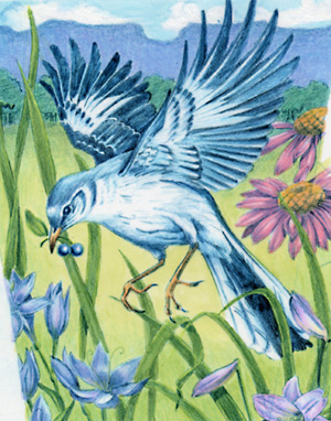 This is old. I'll say that straight out. But it's got a story. I've told y'all that I was a corporate in-house illustrator for many years before I moved into children's books. Well, I drew this for a box of bird-seed for a gardening company a long time ago. I drew it. I didn't color or render it. It was sent out to a freelance illustrator to paint the final. What!? Yup. At one of the companies I worked for, it happened a lot actually, and let me tell you, it gave me the serious blues. But back then, while I could draw my little tootsie off, I couldn't color very well. I could do flat color, cartoony stuff with my eyes closed. But the fine-art look, highly painterly styles, that wasn't me. "But aren't drawing and painting the same thing," you ask? Not at all. Knowing how to draw with black and white (pencil, pen and ink, etc.) is completely different from learning how to apply color well in any particular medium. Color is a finicky thing. Applying atmoshpere and light with color is a completely independent skill. You can't just make a color darker to throw it into shadow. Colors change, they grow cool and hot, they oppose each other. Color can cause objects to jump forward or hide in the back. Using color incorrectly can make a piece feel flat, or it can push things forward and back that shouldn't be, making the perspective feel wonky. Think about it. Have you ever seen artists who could draw like crazy with graphite, but the second they rendered their art with color, it went south like a duck in winter? When I first dove into freelancing with my own art, I had to figure out what my medium was, and then I had to become proficient with that medium to apply color effectively. It took several years and a lot of work. I feel like I'm only now reaching my stride. Nowadays, the puzzle I enjoy most in my art is tweaking color and light, making them really work. So now, I can finally work with color. I can pull off those painterly looks I always admired, but I always regreted that I hadn't rendered some of my earlier drawings and sometimes go back to them to see how much I've improved. I revisited this particular piece several times over the years in several different mediums (this one is colored pencil), and while I still don't think it's a success color-wise, I did reach a level where I thought, "It's okay." Of course, if I did it again today it would be completely different. Learning how to paint and render my own drawings has been an interesting journey for me though. I hope it's interesting to budding artists as well. Labels: IF, Method
Fuse #8 and other Podcasts/Webcasts I love
Betsy Bird has taken the leap - she's gone to audio. We can now listen to her awesome reviews along with reading them. She's got a good voice for podcasting and she sounds just as quirky as she reads - fun! (Mostly MG fiction.) This brings up podcasts in general, and I'd be remiss to not mention some of my favorites. For those who love to follow authors on their book tours, go to Authors on Tour run by the Tattered Cover Bookstore in Colorado. These are mostly adult authors (clarification: people who write for adults rather than children), but they occasionally get some crossovers. The Library of Congress' National Book Festival. These are webcasts rather than podcasts (you can see the authors), and they have a ton of children's book authors and illustrators you can enjoy. Check out previous year's shows too! BEA podcasts. These also tend to include a lot of adult authors, but have some great panels and commentaries on the publishing industry. It's where I learned about BookTour.com where you can find out who's touring in your area and go see them in person! Meet the Author Bookbites. More authors than you could possibly imagine doing private interviews. Very cool. TeachingBooks.net does interviews with authors and illustrators (webcasts). Not all are free, but a few fun ones are - just to tempt you. Kidvidlit. Okay, this one is rather new to me too, but it looks like a lot of fun. They're silly videos of authors and their writing lives. (Beware they take a little time to load and crashed my browser once.) BookVideos.tv also has well done videos of authors talking about their books. (A whole section of children's book authors!) Horn Book has decided to jump into podcasting as well and you can listen to their first foray: an interview with Jon Scieszka. They have a distinct advantage in their new venture - who wouldn't want to be interviewed by Horn Book? I long for the day when they knock on my door . . . And last but not least, especially for the kiddies, you can see picture books read online by famous folks at Storyline Online. Very good. Have more links to offer? Add them in the comments! Labels: General, Method
 I have the honor of creating a snowflake for Robert's Snow this year to help raise money for cancer research. This is the third year illustrators have pitched in to help with this cause, and for good reason. One of our own has been too closely affected by this horrible disease. The story is worth reading about, and the snowflakes, which are auctioned off, are a joy to see. So, needless to say, I'm so happy to be involved. The snowflakes are all original pieces of art. However I work digitally (the most original art I create is a first run giclee), so what did that mean to me? To the matresses . . . I mean, pull out the paints and see if I can get these muscles to do what I want! The great thing is, while I was improving with my digital art, I was learning a lot about traditional media. I never claimed to be good at mixing colors (which is part of why I went digital). Who knew that mixing colors onscreen would teach me how to mix colors off? Well, that's what happened, and I was very pleased with the results. I didn't think to take pictures until I was well into the project, so I jump around a bit, but I'll walk you through my process: 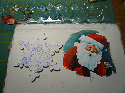 I had to practice to get my hands used to working with a brush rather than a pen-mouse, and experiment with how the acrylics would react. I certainly didn't want to practice on my snowflake! So, I bought a piece of masonite similar to the material from which the snowflake was made and cut it down to small pieces (about 8.5"x11"). I prepared the surface by layering it with gesso. One of the things I always try to achieve with my digital work is that wonderful rich texture and transparency you get with paint. So, layer after layer of gesso, I used a dry brush to cross hatch when it was close to dry. After four or five layers, I had a nice solid white with a rich texture. I then used Saral paper to transfer my art to the masonite. It worked very well as you can see the back design on the left. 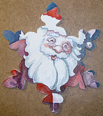 I also wanted to experiment with "scumbling." It's a fancy word for painting the darks first, letting them dry, then layering thin, lighter colors on top. (This is where the transparency comes in.) It's also about the only way to get gentle shading with acrylics - they just dry so darned fast! (They do make solutions to extend the drying time if you want to experiment, but I didn't want to go there.) So I went in with the darks first. Here you can see I've already started to layer in the turquoise sky and vermillion santa suit. 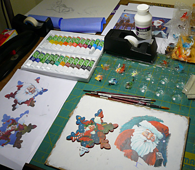 I especially liked the way my workspace came together through this. I bought a set of small tubes of acrylics. Because they dry so quickly, smaller tubes encourage you to squeeze out less and therefore lose less to drying (okay, and after much digging, I couldn't find my acrylics!). It's also amazing how little paint you actually need. I saved plastic egg crates and used them as my palettes. (I can't tell you how many expensive palettes I've thrown away that I could never get clean - this worked GREAT.) By the way, my brushes did not sit above my art while I worked - I've heard horror stories about that kind of thing. I moved them over for the photo so you could see the size brushes I used. So the main things I learned: there are major advantages to working small; use egg crates for palettes; take your time and let the layers build. I have to say, I really enjoyed this. I may actually try to do more projects in the future just for fun. Here is my finished snowflake front and back: 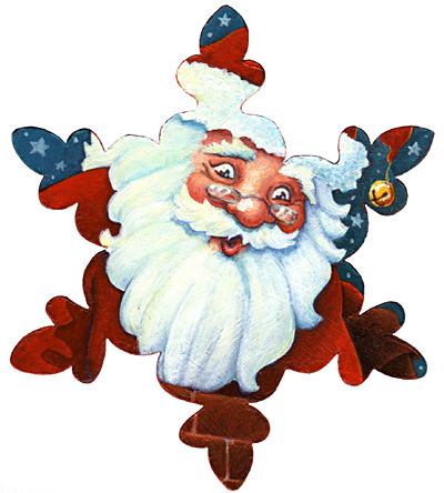 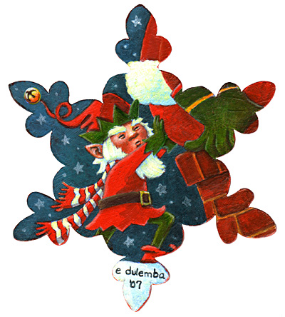 I sure hope whoever purchases my snowflake gets in touch! Labels: BigNews, Method, Robert's Snow
illustration Friday: Discovery & Postcard Demo
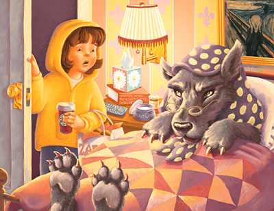 Little Yella riding hood went to visit her Grandma (with a bag full of bagels from Zabar's and a Starbucks Chai Latte) only to discover . . . A while back, somebody asked if I would talk about my process with promotional postcard mailings. Since I'm using my latest postcard art for IF this week, I thought it would be a perfect time. I like to use Premium Postcard for my printing. They have no minimum print requirements which means I can send out a very targeted mailing list for less money. They are also run through the US Postal Service, so postage is included in their prices, and I can do everything online, including build my mailing list. When I'm ready to send my postcards, I just upload my art, click the names I want to mail to, and voila! I do, however, mail myself a proof postcard first. PP uses a coated glossy stock which holds up great in the mail and looks very professional, however, it tends to blow out the saturation of my art. So I usually send a very dummed down version of my art colorwise to get a good result. I build my postcards in Photoshop and save them as .jpgs to upload. Here's the front of my latest:  Notice I have my name and contact information on the front. Art Directors will often pin postcards they like to a bulletin board. You never know what could sway an Art Director to hire you over somebody else, so make things easy for them. Include your contact information on the front so they don't have to fumble with your postcard to get in touch with you. Here's the back of my postcard: 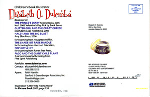 On the back I include my name, relevant title (children's book illustrator), a list of books I've illustrated with the publisher's name and any accolades they've received. I have my website address so they can see more of my art at my online portfolio (this is important and what makes the postcard/website advertsing technique so effective.) I include contact information for me and my agent. The art for this particular postcard is also published in this year's Picture-Book annual, so I included the page number. PP also has room for a small vignette of art - I included the "snout cream" from the bedside table. (This is an actual mailed postcard, so you can see the USPS logo and mailing strip.) I mail different art out three to four times a year to a mailing list I've pulled together by studying trade magazines and researching online. It's down to a select group of Art Directors and Editors with whom I'd especially like to work. And that's it! Hope you find this helpful. Labels: IF, Method
Another Young Author/Illustrator Opportunity
I love posting these when I come across them: M E D I A R E L E A S E CONTACT: Virginia S. Grenier Editor, Stories for Children Magazine Email: storiesforchildren@vsgrenier.com For Immediate Release Stories for Children Magazine Is Looking for Young Writers! Stories for Children Magazine, which debuted April 1, 2007, is looking for stories, articles, and poems written by young writers ages 17 year old and younger. VS Grenier, editor of Stories for Children Magazine stated: "Stories for Children Magazine is not only for adult writers. One thing that makes us who we are is that we also publish stories by children and teens. After writing for magazines I noticed that there were only a handful that allowed underage writers. I couldn't believe it. How could the writing world not embrace the young it already writes for? I decided to change all that with Stories for Children Magazine. My goal is to have at least one story, article, or poem written by an underage author. After all if we don't help embrace the future writers how do we expect children to love the world of ink?" Stories for Children Magazine is a free monthly on-line magazine for children ages 3 to 12 years old. Children will journey into the imagination with short stories, articles, crafts, puzzles, and so much more. Each issue also features a Children's Author and/or Illustrator. Now come enter into the World or Ink at Stories for Children Magazine! View guidelines at: http://storiesforchildren.tripod.com ### Full Media Kit, Magazine Cover Art, and more are available upon request electronically. ------------------------------------- Thanks from Gayle. :-) PLEASE NOTE: Stories for Children is closing submissions on June 24th (youth can submit any time) and will not open again for submissions until September 1st; however, there WILL be a magazine coming out online for July, August, and September during this time. :-) Labels: General, Method
 Ain't technology grand? This is why I try to stay on top of things. So I'm listening to a podcast from BEA on "Free Lunch." And it's several top guys talking about the whole "free content/information" movement on the internet, including the Editor-in-Chief of Wired magazine, Chris Anderson. Sounds kind of boring for a children's book creator maybe? Well, Chris goes on to announce the brand spanking new site he's made available called BookTour.com (you can see my listing here). It's a site for authors to post their upcoming book tour events. As a user, all you have to do is plug in your zip code to find out about upcoming signings/events in your area. Wow. Not too long ago, I actually wondered why there wasn't something like this in existence. It would seem great ideas hang out in many heads (which is why you should always jump on yours). I do wish they would make classifications for illustrators and genres, but it's in BETA, so this could very well be in its future. In the mean time, I'm listed, and I'm keeping an eye on this baby!! Labels: Method
Catching up & rearranging refrigerator magnets
Yo ho! I'm back with the living, well sort of. I brought home a cold from my weekend in the mountains as a souvenir. Yuck. Anyhow! My Creating Picture Books class at John C. Campbell went well. I had six students of various levels and expectations which is always challenging, but exactly what I love about teaching. It's a constantly shifting puzzle to figure out how to relay the most pertinent information to each particular brain in the most effective way. It was also the first time I'd taught that information in such an intense environment. I've given my "Nuts and Bolts" of children's book publishing several times at conferences, but this was an entire weekend and added a lot of focus on writing. I believe we had some real successes with some of the students, so I was pleased. Speaking of writing, I've just sent out a revision of my novel, "A Bird on Water Street." Now, I love the internet, but sending a novel via email is so . . . anticlimactic. Where are the trumpets? Where's the mojo from my postmasters? Where's the ceremony? And what do I do now? I'm all wound up. So, I have created an "I just sent it out" ceremony in celebration . . . rearranging refrigerator magnets! Yes folks, it's all the rage. I grouped my take-out Chinese menus under one clip magnet and my pizza delivery menus under another. The classic monster cereal magnets are lined up in a neat, orderly row. OCD you say? No way. It's a ritual! It's a ceremony! And I somehow feel much better about sending out my manuscript. Oh, and just in case there is anything to that whole The Secret thing - my manuscript will be sold within three weeks. It will be fought over, a bidding war will ensue, and it will be purchased with a two book deal. Oh the glory. Labels: General, Method
A Door for the Decatur Arts Festival!
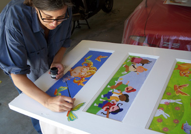
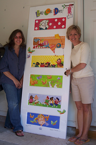
Have I been quiet lately? Seems like it from this side. Why? Because I've been incredibly, insanely busy of late (14 hour work days, no lie). I won't bore you with the details but I do want to share one of the projects I just finished. 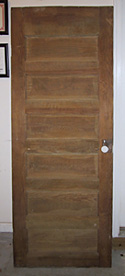 Diane at Little Shop of Stories roped fellow illustrator, Liz Conrad, and me into painting a door to be auctioned off at this year's Decatur Arts Festival. This turned out to be quite the project when the old, stripped, mission-style (aka heavy) door arrived. It took five coats of primer and paint to cover each side - no small task! 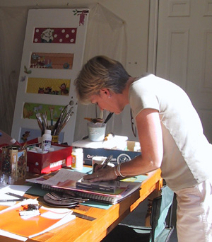 After days of prep, it was time for Liz to come over. We set up a great work space in the garage with hubbie's stereo blasting awesome tunes (yes, it's his favorite room). The weather was beautfiul and our supplies were plentiful. Now, what to do? 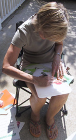 We decided to lean on the bright colors both our illustration styles share and created a rainbow palette on the inset panels. To those we added cut-outs from our books (the galleys and such). Here's Liz doing her amazing cutting thing (cut paper is her preferred medium, so she's a whiz). We ended up using a combination of paint, collage, decoupage, 3-D, you name it. Here's me painting antennae on one of the carrot butterflies from Glitter Girl and the Crazy Cheese. The cool thing was, collaborating and working with paints and modge podge was something neither Liz nor I had done in a long time. We worked well together and it ended up being a fun break and a wonderful creative exercise. We really enjoyed it.  It took two days to complete and we were pretty darned pleased with the finished door, must say. We both agreed it would be a fun, colorful addition to a child's bedroom. (Hope the purchaser sends a pic if they come across this blog post.) Here's the finished product:  It will be included with the other colorful doors around the gazebo downtown during the arts festival. I'll be teaching Creating Picture Books at the John C. Campbell Folk School, so won't be there to hear the oohs and aahs, but Liz promises to share pictures. In other words, more to come!  Labels: Events, General, Method
 I clued into this last year and had to share. Book Expo has a podcast series of authors and people in the biz during and around Book Expo. You can subscribe to the email newsletter alerting you to what's available with links to listen. Easy peasy! Click on the logo to learn more. Labels: General, Method
 I taught my annual Beginning Drawing class at John C. Campbell Folk School in North Carolina this past weekend. Being around May Day, we were treated to Garland, Maypole and Morris Dancers. These are images from the website as it was rather drizzly weather during the performance.  I especially liked the Morris Dancers. They had bells on their legs, clacked sticks together, and their faces were covered with blue paint. The story is, if you were kissed by one, you'd be pregnant before the year was out. Well, these are all fertility rites anyhow. Much fun to see. I also had a great group of students. All claimed to be beginners, but I was so impressed with the drawings they created. I'll post the final gallery show as soon as I can figure out how to get the images off our new camera. I'll be teaching Creating Children's Picture Books at John C. in two weeks. There's still time to sign up if you'd like to join us. What an inspired and beautiful place to hang out. I'm looking forward to going back. Labels: Method
 If you scroll down, you'll see I've added a new feature to my sidebar. This is Shelfari - a website where you can create a bookshelf of all the books in your library, your reading group collections, your favorites, you name it. I know there are other programs out there that do this, but I found this one especially easy to use. I'm slowly adding my children's book collection which will take a while, let me tell you! The cool thing about this feature is by clicking on the covers you can learn more about the books or even buy them. It also feeds into my Amazon associates account, which is a way to make pennies (or Amazon credits - woohoo!) off of referrals. Now I will always say you should go to your local indie bookseller first, but having lived off the grid in the north Georgia mountains, I know that just isn't possible for everybody. Anyhow, it is in beta so is a bit clunky in some browsers (and please tell me if it's made my blog go wonky in your browser, especially if you're running IE on a PC), but I think I've made a new friend. Labels: General, Method
 Tired and Wired. That’s what I am. I just finished an intense weekend at the SCBWI Southern Breeze Springmingle conference. I don’t care where you are in your children’s book career, conferences are FUN. They are opportunities to hang out with lots of people who just plain “get it.” They get how difficult it is to break into this industry. They get the passion for children’s books, and they get the desire and work it takes to contribute. And we’re odd birds, y’know. I’ve never met a children’s book author or illustrator who wasn’t intelligent and curious about the world around them. It makes for easy and interesting conversations no matter who you end up sitting next to. Along with being an attendee this year, I also gave portfolio reviews, which is something I love to do. My history in graphic design and illustration makes this a fairly easy exercise, and the teacher in me loves to give what I hope is helpful advice and pointers. Some artists’ work I had seen before and I was happy to see growth in skills. Go illustrators! This year’s conference had some great speakers too. Gretchen Hirsch, Assistant Editor at Harcourt Children’s Books, shared interesting perspectives as an Assistant Editor who works with picture books. Especially helpful was her break-down of the hierarchy at Harcourt: Editorial Assistant > Assistant Editor > Associate Editor > Editor > Senior Editor > Executive Editor > Vice President and Publisher. She suggested targeting Assistant Editors with submissions as they are starting to acquire their own manuscripts (with guidance from their Editor) and are eager to establish their own list. Claudia Gabel, of Delacorte Press, has a background in book packaging and therefore presented a more formulaic approach to the structure of mid-grade and young-adult novels. She stated the importance of establishing a “hook,” an unusual twist in plot or structure of a book that makes it commercially viable. I found her advice of dealing with a plot driven story in three Acts extremely helpful. It’s based on the classic Shakespearean structure, but she shared page counts per section and what stage of a story should be happening where within that structure. In Act I set up the story and end with an inciting incident in no more than 50 to 70 pages. In Act II, the meat of the story, end each chapter with a mini-cliffhanger, something to make you want to turn the page, and end the act with a high stakes situation which is nearly impossible to get out of. This section should be about 100 pages. Finally, in Act III, resolve the story, but make sure the resolution is not by coincidence. Readers want heroes - give them one. She said your character should want something in the beginning, but by the end realize what they need is something else. Barbara Seuling, Grande Dame of children’s book writing and illustrating, was delightful. She was well-spoken and knowledgeable as she shared her thoughts on the business as one who is highly established. She never forgot her roots however, and makes a point to visit every region of the SCBWI and share her experience with beginners. What a generous spirit. And finally, Michelle Poploff, author, VP and Editorial Director for Random House’s Yearling and Laurel Leaf imprints and Executive Editor of Delacorte Press, a true heavyweight in the business. She looks exactly like you would expect an established editor to look, intelligent, sharp and comfortably confident. I couldn’t believe what I heard as she described what she was looking for, basically describing my book, “A Bird on Water Street,” until she mentioned she was currently working on a book about mining (my book centers around the closing of a copper mine). However, I was thrilled (notice that manic-depressive pattern I talk about in this business?) when she sat down with me and my new friend, Shelli Johannes-Wells, and said she had read my book. What!? Turns out she was one of the editors to whom my agent sent my book (go Faith!). Ms. Poploff talked about my book and the characters and asked me about the setting (can I tell you what a strange experience it is to have your creation quoted back to you?). She mentioned it needed some work in places, which I expect, but said she didn’t think Faith would have trouble selling it. OMG. Do I need to explain how validating this was? Can you blame me for being a bit freaked out that one of the top editors in this business read, remembered and said kind things about my First novel which took me almost four years to write? Wow. So, along with getting to hang out with my buds Liz Conrad, Vicky Alvear Shecter, and new friends, I received some wonderful feedback, and much needed validation. Kudos to Jo Kittenger, Donna Bowman, Robyn Hood Black, and all the volunteers for pulling together yet another fantastic conference (and to Tina Bilbrey who created the great logo). Labels: Events, Method
Do you follow the biz?
I try to as best I can even though I am so far away from the publishing hub of New York. I've been reading the publishing houses' financial summaries via Publishers Lunch and was a bit confused about the overall message. I want to know, "are children's books on the rise, on the fall, or somewhere in between? Which children's markets are strongest?" Well, PW came out with an article that everybody remotely connected with picture books should read, "Are Picture Books Back?" Do it. Go read it now. Labels: General, Method
The Bird has flown the coup
Just got an email from my agent. My first novel, "A Bird on Water Street," went out to publishers Friday. All I can say is, Weehaaa!!! And Ee Gaads. And I'm a nervous wreck! A friend said I shouldn't be a nervous wreck yet - more like a few weeks from now when we might actually start hearing responses. I tell ya - this business moves slower than molasses in winter. But once things are out there, it's like jumping off a cliff. Will you fly? Will you crash and burn? You just don't know. It's a heckofa ride. Weehaaaa!!!Labels: BigNews, Method
A friendly get-together and "The Zone"
"Come meet us for breakfast," my friend said. "But I just ate," says I. "You need to get out, c'mon," says my friend. But I was already "in The Zone." What exactly is The Zone? It's this strange, otherworldy place my brain goes to when I'm creating - and I must admit, it's not a completely comfortable place to be. It's a release of myself and everything around me. In the zone, time flies quickly and very little can pull my attention away. I can go into the zone at 11:00am and come out at 4:00pm wondering, "What just happened?" It's a little weird. The more I write and illustrate, the more I realize how necessary it is to let The Zone take over. I've discovered that reading emails and checking blogs isn't just procrastination - it's how I slowly wind into The Zone. It's an important part of how I work. However, I'm also starting to realize that I have to balance it with a bit of real life. See, the The Zone is slightly addictive. It sucks me in and would really like to keep me there. It wants to rule me - scary! But if I let it keep me, I can stay holed up for days without any human interaction, and my social skills really do suffer. So this morning I said yes to my friend and I met her and her daughter at Thumbs Up Cafe. I got a take-out salad for lunch and caught up on what she's up to, as well as some other friends who I haven't seen in a bit. And y'know what? I feel better, I feel more human. I am a social creature after all. And now that I'm a functioning, interactive part of society, I am once again ready to sit down and go into The Zone. Labels: General, Method
Great feedback on 1st Novel!!
Okay - so I'm getting into the groove of my 2nd novel, but I have to put it aside for a bit. I just got fabulous feedback on my first novel from my agent and her assistant. They love it. Woohoo!!! Could I be any happier? They do have some suggestions, none of which have to do with the story or my writing style - they're all really good suggestions that will make the book a little more marketable, timely, fleshed out in a few places where they wanted "more." In other words, the kind of changes you Want to hear. I'm thrilled. This is the kind of input I really look forward to and appreciate. Buried in thousands and thousands of words, it can be hard to keep it all straight in your head, so to get positive feedback is first, much needed validation, and to get information on how to make it even better is like working with a talented art director - it really does take a project to the next level. I don't know, maybe it's my days from graphic design working with teams and Art Directors, but I do feel like one person creates the initial *kapow* and then a team of people shine it up. I like the feedback and direction. I like the input. And I like being given the tools to take my initial *kapow* and make it *KAPOW!!* So, here I go . . . I've got work to do!! Labels: Method
New Novel
I started a new novel today. Well, writing it anyhow. This one's been on my mind for a while, and unlike my first, I know how it ends. In fact, I know most of the story, I just need to get it onto paper. Starting a new novel is almost worse than starting a drawing. Wow, and I thought a blank sheet of paper was scary then! I've been procrastinating - my vice is twiddling with my blog or website (strange, sick hobby, I know). Hubbie and I went out to dinner last night, and he's so amazingly supportive. "Just start writing it!!" he says. "Okay, okay!!" Y'know, having one under your belt doesn't seem to make doing another one much easier, except for the fact that you do know you can finish one. And that seems to be something. Walking has become a fun way to work out the story too. Three miles zoomed by without my hardly noticing today. My mind is stuck in my story going, "what happens next?" and "what if..." It's actually pretty fun. Everybody always accused me of having my head in the clouds most of my life anyhow. Now, it's just on a specific cloud. :) Labels: Method
Illustration Friday: Smoke
Well, I had about three pieces of art that fit this week's theme, however they were all still in black and white. So I'm going to take one of them all the way and show you my progress. This is a piece from my picture book dummy, "Queen Bea." First is the line-art version. I usually do sketches, scan them into the computer, then arrange my composition. Sometimes I then do a cleaned up line-art version to then work from. But I have to say I probably won't create line-art anymore. Editors seem to respond better to pencil sketches - where things look more rendered in black and white. My line-art seems to have more of a cartoony look that doesn't hint enough at the extent the final piece will be rendered.  So here is my next stage, flat color. I set the pencil or line-art layer to multiply in Photoshop. I work on a flat color layer below it. I may go in and add a few more color blocks to indicate light and shadow, but this is almost finished with stage 2.  Next I'll pull it into Painter where I do my shading and rendering. You'll have to check back to see how the piece ends up - it usually takes me a few days.  Update: Thanks for all the great comments - I'm so glad some of you find my process helpful. I used my weekend to finish the art - isn't that what weekends are for? Anyhow, the last step was to render in Painter then pull it back into Photoshop for minor adjustments. Click on the final piece to get a better look. Labels: IF, Method
Turns out the main servers for my hosting company were located in downtown New Orleans. Not only did the servers go down, but one of the guys there stayed in his office and kept a blog of what was going on outside. You may have heard about him in the news, reporters were constantly contacting him. Amazingly, my website and my blog were down for only a day and a half! I am so impressed that they were able to get things rerouted (not sure what they did really) in such a short time, and in circumstances I can't even begin to imagine. I didn't expect to be back up and running any time soon, and I was willing to wait. DirectNIC has been a great hosting company. This is the first and only time they have gone down in the several years I've been with them. No, they don't support higher programming languages for bells and whistles (part of why they are SO inexpensive), but I've been very pleased with my site using basic HTML and some javascript. I tell ya, they were good before, but they've just gained a customer for life. Labels: Method
Well, I finally did something I was avoiding since the creation of my website. I use a very basic hosting company (uber cheap), so I don't have any of the bells and whistles that PHP, CGI, ASP, etc can allow. So my portfolio page has been a simple inset frame set-up. Bad thing about that was I couldn't put comments on each illustration unless it was part of the art (which I really didn't want to do). I kept thinking there had to be a way without making an html page for every piece of art, and well, there really isn't. So that's what I did, created html pages for every piece. So now, when you click on a thumbnail, it opens a "bigger" view of the art which when clicked opens an even larger view on its own page with comments. I probably have too much work showing in my portfolio, so it was no simple task. Anyhow, check it out at: http://dulemba.com/index_illos.html. I'm pretty pleased with the way it turned out. Oh, and if you have scrollbars in the initial larger view, please let me know. I tried to avoid them, and don't see them on any of our systems here at the house, but I really thought that would be an issue. I'm surprised it hasn't been . . . so far. Labels: Method
I am a Digital Artist
Well, too funny. Shortly after writing my last entry about digital art - a call for articles for/from illustrators was announced at SCBWI. So, I've combined my feelings with a bit of the history of digital art and my method (which is in my FAQs section of my website) into an article for "The Bulletin: Painting with Pixels." I've just heard that they will be bumping another article to fit mine into the next issue because it is exactly the kind of information they had in mind. Very cool. Labels: Method
Observations on Children's Writing and Illustrating
I’ve been busy creating some new pieces for my portfolio pages, and preparing for Story-time at my local library. I will be the stand in for the month of May. All of this has me doing quite a bit of research. I read almost every picture book I own, a considerable amount, to select ones that read well to a young group. I pulled out my Picture-Book 2004, and went through it with a fine toothed comb to come up with ideas for coloring pages - and I’m learning some new things. From my reading, I’m learning there are some noticeable themes in children’s books. Yes, we all know about fairies and good-night books, but I’ve been surprised to find some not so obvious themes: Acting Out, Dinosaurs, Dragons, Farm Life (usually from the animals’ point of view), Urban life, Dogs and Cats, Wild Animals, Holidays, Bed time, Bath time, and Dreams. I’m also realizing there are holes in some of these categories. For instance, there aren’t enough books about aliens or pirates. I try to fill in with songs and poems, even storytelling, for my Story-time program. But I really have to stretch to keep on theme in some areas. Before I talk about my art research let me mention, I do feel like I’ve gone through a growth period recently with my art. It always seems to work like that . . . you cruise along with your skills on a flat plain for several months or even years, when suddenly *zwooop* - up you go to a new plain of skills. The neat thing to me is, suddenly, I feel like I’m looking at art through new eyes. I’m noticing things I didn’t notice even 6 months ago. So I was searching for ideas, to draw new coloring pages for the kids, by devouring my Picture-Book 2004. What jumped out at me here though, was something I didn’t expect: nuances in illustration skills. Sometimes, an artist can really draw, but doesn’t handle their medium well. Or the detail level is wonderful, but without contrast, creating no depth. Sometimes they can’t draw at all, but they are wonderful designers and have amazing creative ideas. And sometimes an artist will draw wonderfully in black and white, but lose it when they get to color. I concluded there are talents underlying the umbrella talent of illustrator - some are: drawing ability, color understanding, medium proficiency, saturation, proportion, and design comprehension. The ones I really love are the illustrators who excel in all of these areas. Saturation, or lack of saturation, especially, was perhaps my biggest surprise. Many styles and mediums, by their nature, allow lots of paper show through - watercolor and colored pencils for example. This can work, but sometimes it doesn’t. I think a wash of color before rendering can help in so many areas. A tiny example: the light allowed to show in the foreground of a piece, cannot be the same light allowed to show in the background of a piece. Otherwise there is no delineation between the two - no depth. This has been such a valuable exercise, I think I’ll try to do this every 6 months or so, as it seems I still have new lessons to learn even when I look at things I’ve already seen. Training the eye to really see, isn’t that what being an illustrator is all about? Labels: Method
Wow. So I was having issues getting my archives to work. Seems I know just enough about all this to be dangerous. So I sent a help note off to blogger.com. Not only did they get back to me in a timely manner, but they fixed the problem for me! So my archives are now working. Can't ask for better support than that. :)
Labels: Method
My Illustration Method
I received another request asking more detailed information about my method. If anyone is actually reading this thing, here is my response:
Happy to help. I've definitely been narrowing down my method. I do the elements of my drawing with pencil and scan that into Photoshop. After arranging the elements into the composition I want, I colorize that layer to a sepia and set it to "multiply" which makes it transparent to layers below. I create a layer below that where I color in all my flat colors (it's not filling, it's on it's own layer). I then create another layer where I do my rendering. So it looks like this:
top layer - line art set on multiply (or darken if I don't want it that visible)
middle layer - for rendering (sometimes this layer completely covers the bottom layer as I like to have variation and texture in my colors)
bottom layer - flat color (don't ever delete this layer as it also makes it super easy to select certain areas you need to render)
I then pull it into Painter and save a 2nd version. Painter is still not 100% stable, and I've had it quite on me - wiping out the file I was working on. So I save back and forth between two files while working.
In Painter, I select the object I'll render on the bottom layer, move to the middle layer and render. I've found about three or four brushes I use almost exclusively: "Artist's – Impressionist" gives me a wonderfully textured look. "Oils – Smeary Round" is the biggie, and "crayons" which almost burns the color which is great for skin tones (boy do you have to set the opacity low and use light colors!). I use a few others occasionally, but those are my workhorses.
One thing I've found is Painter is lazy about keeping colors true. I've pulled files in and out of Painter where the color has totally changed on me. Photoshop is the stable program, so I always pull my files back into Photoshop and adjust my colors there, saving the final file from Photoshop (using that bottom layer to select the spots that need work).
Hope this is helpful! Labels: Method
Still Experimenting
So, to get the pic at the top of the sidebar - I have to plug info into my profile. Thing is, if you don't put in enough info, the Links section bumps up and crosses over it. I think it's kind of weird how the sidebar works anyhow. If I want to put anything into it, I have to put it into the coding myself. I would think there would be some automatic field where you would do that . . . the same way you post. Hm.
Anyhow, Stan says I'm procrastinating. Which I'm really not. I finished an illustration for GLITTER GIRL AND THE CRAZY CHEESE today, and I'm way ahead of schedule so far. Thing is, these last few pieces are so detailed, they're going to take more time. They already are. I really aught to go put a compress on my eyes for staring at this thing all day. I can always tell if I've been sitting here too long - I start squinting. Which I'm doing.
But this BLOG thing is kinda cool! I'm sort of siked about it. Stan's put new info on his blog too, so we keep bugging each other, "Go look at my blog!" "No, you go look at my blog!" hehe. Labels: Method
The Grand Experiment
Okay. I think I have this thing figured out. I'm using blogger.com to create this. In its template area, you can play with the coding, so I've adapted it to fit in with the rest of my site. Some of the text colors aren't consistent, but I was hitting conflicts with the blogs style-sheet, and the colors aren't objectionable . . . so it stays. The main thing is to see if I even use this thing. We shall see . . . Labels: Method
so I'm going to try to add an image and see what happens.
 Labels: Method
Allrighty, well I'm trying this again. This time it looks to be free and I can apply my template to the coding. So, it will look like my site. Style sheet and everything. Still an experiment. I don't know how likely I'll be to come in here and talk about things online. Dreamweaver makes it so easy to upload stuff, it almost seems like it would be easier to do this by hand. But, we'll see Labels: Method
|
|
All Artwork © Elizabeth O. Dulemba,
- Y'all play nice, okay?
|
|


 Diane at
 We decided to lean on the bright colors both our illustration styles share and created a rainbow palette on the inset panels. To those we added cut-outs from our books (the galleys and such). Here's Liz doing her amazing cutting thing (cut paper is her preferred medium, so she's a whiz).