Illustration Friday: The Blues (and figuring out color)

This is old. I'll say that straight out. But it's got a story.
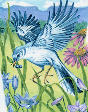
I've told y'all that I was a corporate in-house illustrator for many years before I moved into children's books. Well, I drew this for a box of bird-seed for a gardening company a long time ago.
I drew it. I didn't color or render it. It was sent out to a freelance illustrator to paint the final.
What!?
Yup. At one of the companies I worked for, it happened a lot actually, and let me tell you, it gave me the serious blues.
But back then, while I could draw my little tootsie off, I couldn't color very well. I could do flat color, cartoony stuff with my eyes closed. But the fine-art look, highly painterly styles, that wasn't me.
"But aren't drawing and painting the same thing," you ask?
Not at all.
Knowing how to draw with black and white (pencil, pen and ink, etc.) is completely different from learning how to apply color well in any particular medium. Color is a finicky thing. Applying atmoshpere and light with color is a completely independent skill. You can't just make a color darker to throw it into shadow. Colors change, they grow cool and hot, they oppose each other. Color can cause objects to jump forward or hide in the back. Using color incorrectly can make a piece feel flat, or it can push things forward and back that shouldn't be, making the perspective feel wonky.
Think about it. Have you ever seen artists who could draw like crazy with graphite, but the second they rendered their art with color, it went south like a duck in winter?
When I first dove into freelancing with my own art, I had to figure out what my medium was, and then I had to become proficient with that medium to apply color effectively. It took several years and a lot of work. I feel like I'm only now reaching my stride. Nowadays, the puzzle I enjoy most in my art is tweaking color and light, making them really work.
So now, I can finally work with color. I can pull off those painterly looks I always admired, but I always regreted that I hadn't rendered some of my earlier drawings and sometimes go back to them to see how much I've improved.
I revisited this particular piece several times over the years in several different mediums (this one is colored pencil), and while I still don't think it's a success color-wise, I did reach a level where I thought, "It's okay." Of course, if I did it again today it would be completely different.
Learning how to paint and render my own drawings has been an interesting journey for me though. I hope it's interesting to budding artists as well.


19 Comments:
the first thing i saw was the BLUE background for your blog. and i immediately thought "hey, i recognize that polka dot pattern!"
thanks so much for sharing your bluebird blues!
teri
Great work!
It reminded me that I too have a blue bird drawing. Not to copy or anything, but I think I'll post my image as well!
Keep up the great work!
Sorry. the link for my name didn't work. Hopefully this one will..
It's more than "okay", it's quite lovely in fact. Thanks for sharing the inspiring story.
truely spectacular work
Interesting topic e. You're right, understanding color theory is so important. You can really use it to your advantage to push a piece to another level. I think you've now got a handle on it. ;)
Drawing vs. painting. I work by doing a B&W value study in graphite which I use as an underpainting. To me I'm drawing. Then I slowly start layering color pencil over top. To me this is painting. Yeah, I'm still using a pencil, but it's applied just like paint.
Interesting seeing your older work!
gail
i know what you mean! i am painting a little bit each day in order to teach myself and become proficient. it's hard. good luck! lovely illo
i got a lot out of what you wrote. i had a difficult color experience today trying to mix lots of different blues and it was difficult. it is a difficult aspect of the creative process and does take time to master. very nice work.
This os captivating! So gentle and bright.
Beautiful drawing! And thanks for the inspiring words, it really helps those of us struggling with any new medium.
Wonderful bluebird and I appreciate you sharing the story behind it - it is helpful when I am frustrated with my work to read how others have gotten through their own trials!
i think the day we stop learning and grwoning as artists, the REAL blues will set in. a great perspective on that tricky topic. beautiful color by the way...really well done. :)
Aww. I can relate-- my first pub in Highlights, they took the puzzle idea, and had someone else do the art. I thought they'd bought the art too (esp. since they said-- we'll be in touch about revising this before printing). But the art style they used is a very different one than mine-- and it fit better with the magazine. I understand the decision. But it still made me blue. :o(
What a great story! I do like this piece a lot, especially the wonderful wotk onthe feathers. I think it's pretty darn excellent!
I enjoyed your illustration, and especially your words. It was a good read. This whole illustration thing will be a lifelong journey of learning and growing.
Thank you for your story. It helps all us illustrators remember that we have to strive in every aspect of our illustrating.
I love looking at your awesome blog & website.
N.
great story e!!
WoW! Excellent piece! The story that goes with it is very interesting. Thanks for sharing.
Excellent work.Thanks for the inspiring words.Keep up the good work.
Regards,
SBL-Photoshop Masking
Post a Comment
Links to this post:
Create a Link
<< Home